
I was the frontend developer on Mivi from the beginning. Not "since the redesign" or "since the migration" — since the first product page went live.
Mivi is India's first audio manufacturing tech brand. Bluetooth speakers, earbuds, neckbands, mobile accessories — all designed, manufactured and sold out of India. They're not a reseller with a logo. They make the product. And when I joined the project at Able.do, they were growing faster than any storefront could comfortably keep up with.
The pace
There were days when Mivi launched three or four products at once. Not variants — entirely new products, each with its own specs, its own photography, its own story to tell. And the turnaround? Two days. Sometimes less.
That was the rhythm I worked in for four years. A product brief lands, you get the assets, you build the page, you test it, it ships. Then the next one lands. There's no sprint planning for this — there's just a pipeline that either keeps up or doesn't.
Being the frontend developer at that pace means you stop thinking in pages and start thinking in systems. You can't hand-craft every product page when four of them need to exist by Thursday. The system has to do the work, or you drown.
The Rhythm
What "launch speed" actually looked like.
Open source to Apex
The site started on an open-source e-commerce platform. It worked — until it didn't. When you're processing thousands of orders, managing shipping flows, running influencer campaigns, and trying to give each product its own personality on the frontend, the limits of a general-purpose platform start showing up fast.
The team at Able.do had been building a proprietary platform called Apex. Purpose-built for the kind of creative flexibility Mivi's product pages demanded — and the kind of operational scale their backend needed. The migration wasn't a rewrite from scratch. It was more like lifting the entire storefront off one set of rails and setting it down on another, while the store stayed open.
My job was the frontend side of that lift. Rebuilding the component layer, the product page templates, the cart, the checkout flow — all on the new platform — while making sure customers never noticed the switch. That day, the design didn't change. The architecture underneath it did.
Mivi has since moved off Apex. Everything here describes the storefront as it ran during my time on it, 2018 to 2022.
The Migration
What changed under the hood.
The design evolutions
I'd call them evolutions, not redesigns. A redesign implies you throw things away. What happened with Mivi was more organic — each iteration grew out of the last one because the pace demanded it.
The first product pages were bespoke. Custom layouts, hand-placed elements, one-off animations. They looked good, but they took too long to build. When you're shipping three pages a day, "bespoke" is a luxury you can't afford.
So the system evolved. Layouts got componentised. Typography became systematic. Animations turned into reusable patterns instead of one-off flourishes. The design didn't get simpler — it got more disciplined. Every product page still felt distinct, but the bones underneath were shared.
That's the thing about building under pressure: you don't plan a design system, you discover one. Each launch, each late-night product page, each "we need this live by morning" — they all carved the system into shape. The constraints did the design work that a committee never could.
The Evolutions
How the frontend matured — not by plan, but by pressure.
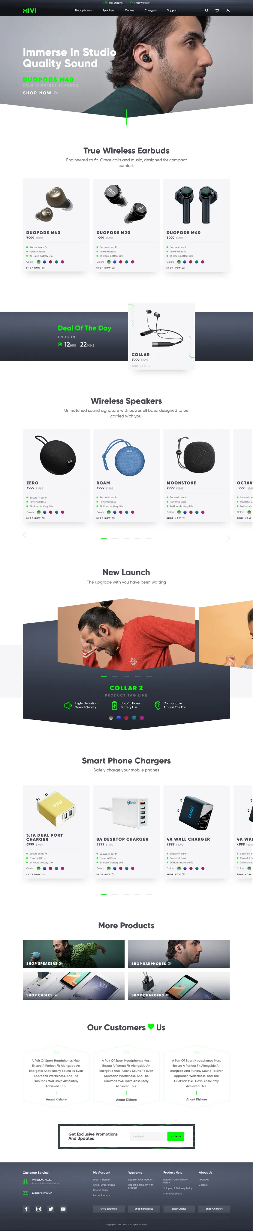
The whole homepage, one component system — hover (or scroll) to walk the full page.
The frontend stack
The final system — what Mivi ran on when I handed it over — was a fully custom frontend on the Apex platform. Every piece was built to solve a real problem that showed up at scale:
- A componentised UI library that let each product page feel unique while sharing structure underneath.
- Dynamic product pages the content team could manage without a developer — specs, images, copy, all CMS-driven.
- A live cart and checkout flow that handled flash sale traffic without falling over.
- Transactional mailers — order confirmations, shipping updates, return flows — all templated and branded.
- Mobile-first from day one, because Mivi's customers are largely on mid-range Android devices. If it didn't work on a ₹12,000 phone, it didn't work.
The site served two languages' worth of product content across dozens of SKUs, handled campaigns, discount codes, and influencer attribution — and the content team ran it day-to-day without engineering support. That's the real measure of whether a system works: can the people who aren't developers use it without calling one?
What I learned
Four years on one product teaches you things that project-hopping doesn't. You see the consequences of your early decisions. You live with the shortcuts. You learn that the component you built in a hurry at 2am is the one you'll be maintaining for the next three years.
The biggest lesson: speed and quality aren't opposites. They're the same discipline. When you have two days to ship a product page, you can't afford to be sloppy — sloppy means rework, and rework means you miss the next launch. The pace forced the code to be clean, the components to be reusable, the system to be predictable. Not because anyone mandated it. Because the alternative was missing the next launch.
What I'd improve next
- Performance audit on the heaviest product pages — image optimisation, lazy loading, bundle analysis.
- Structured data (JSON-LD) for every product — Mivi's search presence could have been stronger.
- A shared animation library with reduced-motion support baked in.
- Better preview tooling for the content team — let them see exactly what a page looks like before it goes live.
- Accessibility pass across the full checkout flow — screen readers, keyboard nav, focus management.
Next up
7 min · 2022–24
The Scroll Problem
Case Study · Keus