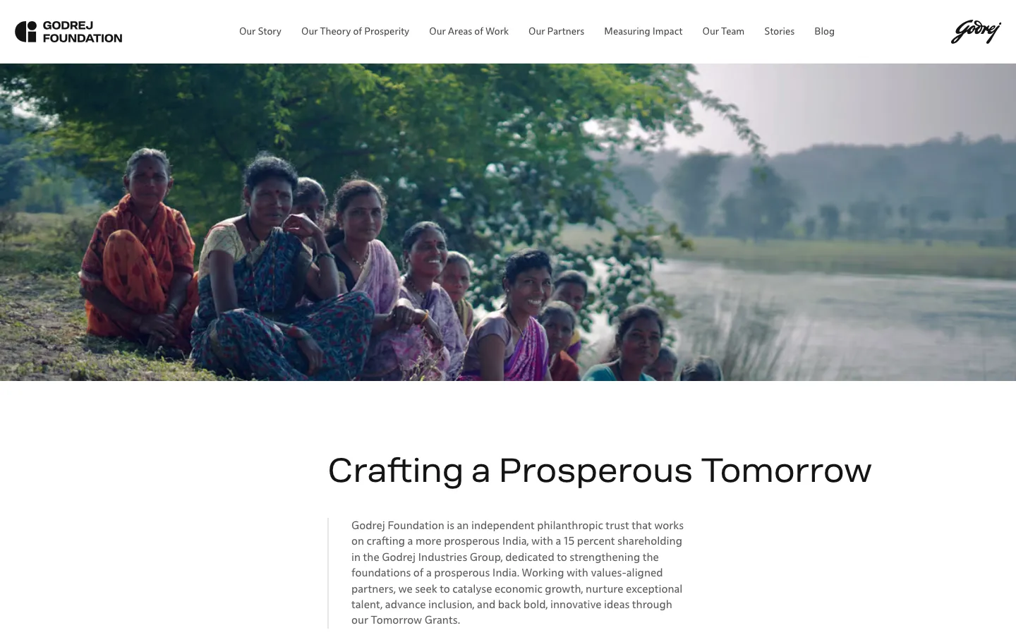
Godrej Foundation is an independent philanthropic trust that works on crafting a more prosperous India. It holds a 15 percent shareholding in the Godrej Industries Group, and its philanthropy goes back to the Godrej family trusts of the 1970s; the group itself was founded in 1897, one of India's oldest. The foundation works on strengthening economic growth, advancing inclusion, and backing bold ideas through its Tomorrow Grants programme.
The brief was to build a website and a content management system that the foundation team could run themselves. Not a marketing site — a living platform for reporting impact, publishing grant updates, managing partner profiles, and telling the foundation's story in a way that matched the weight of the work.
v1 — The first build
The first iteration was designed by 3 Sided Coin — a design studio with a strong editorial portfolio, and a design system that set the bar for the build.
Their design for Godrej Foundation was clean, editorial, and built around the old Godrej identity. Warm tones, full-width imagery, and a layout that let the foundation's work speak for itself. A large banyan tree dominated the hero — grounded, enduring, a visual metaphor for the kind of institution Godrej Foundation is.
I built the entire frontend from their designs and wired it up to a custom CMS personalised for the foundation's workflow. Every page, every section, every content block — editable by the team without a developer in the loop.
The CMS
What the foundation team can manage on their own.
The CMS wasn't an off-the-shelf tool with a Godrej skin on top. It was built from scratch to match how the foundation actually works — their content types, their publishing flow, their approval structure. When the comms team needs to add a new partner or publish a grant update, they log in and do it. No tickets, no staging environments, no waiting.
The rebrand
Then Godrej rebranded.
The 2024 restructuring had split the conglomerate into the Godrej Industries Group and the Godrej Enterprises Group, and on 22 April 2026 Godrej Industries unveiled a new corporate identity to match — a geometric "GI" identifier used alongside the Godrej signature, a custom typeface, GI Sans, and new guidelines, built by its in-house design team. Not a colour tweak. The group's corporate surfaces had to change, and the foundation website was one of them. The design I'd spent months building was suddenly out of date.
Before & after — the same site, two identities
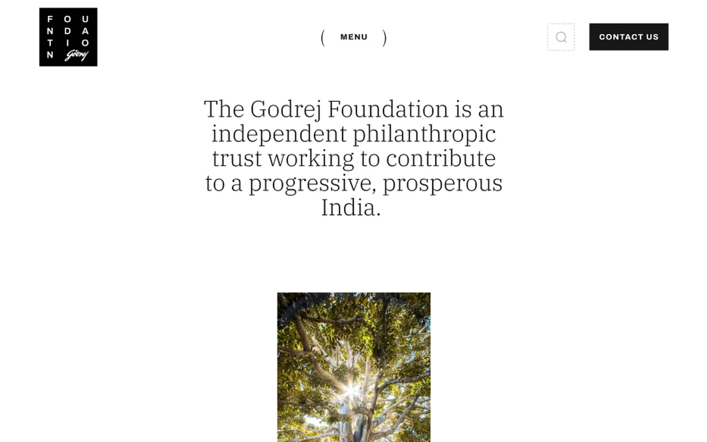
v1 — designed by 3 Sided Coin, old Godrej identity
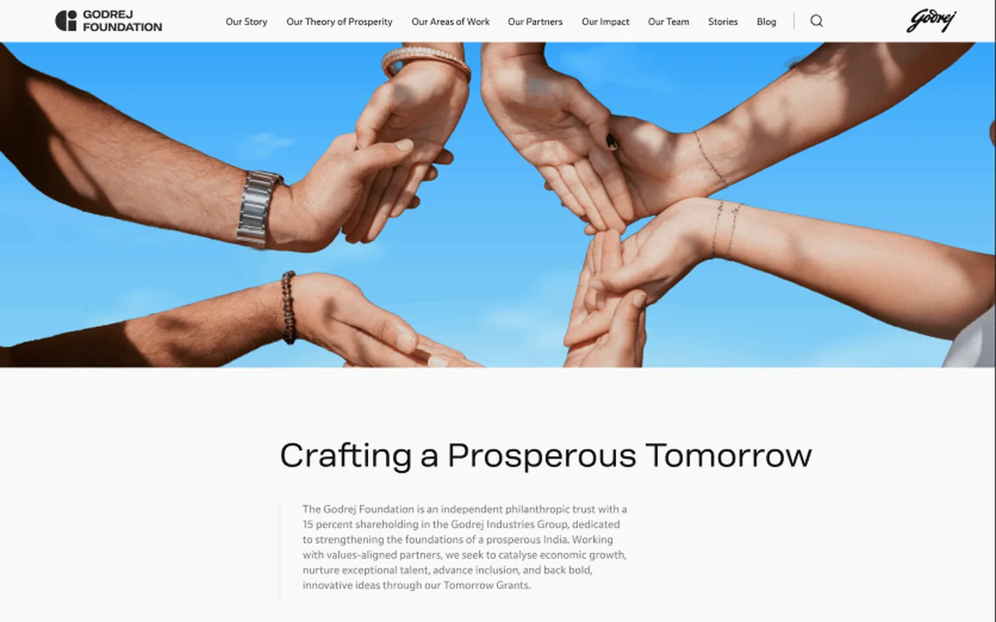
v2 — post-rebrand, new Godrej identity
Look at the two side by side. The old version is warm, editorial, text-forward — the banyan tree anchoring the page with its roots. The new version is lighter, more modern, with the hands reaching toward the sky as the hero motif. Different mood entirely. Same underlying mission, completely different visual language.
v2 — The rebuild
The second iteration wasn't a reskin. A rebrand at this scale changes the hierarchy of information, the rhythm of layouts, the way photography is used. The new Godrej identity has a different logo, different type hierarchy, different colour sensibilities. You can't just swap the palette and call it done.
I rebuilt the frontend from new designs — new component library, new layout system, new visual patterns. But here's where the architecture paid off: the CMS didn't have to change.
The Rebuild
What changed between v1 and v2.
The CMS survived the rebrand untouched. Every piece of content the foundation team had created — every partner profile, every grant update, every impact report — carried straight over. They didn't have to re-enter a single thing. That's the advantage of separating content from presentation early: when the presentation layer has to change, the content doesn't care.
The stack
Both iterations run on SvelteKit with Tailwind CSS. Content lives in Apex, Able.do's own CMS platform; the site fetches it at build time and renders pages on the server from that snapshot, so publishing means a rebuild and a redeploy. Tailwind handles the design system — spacing, typography, colour tokens — making it possible to rebuild the visual layer quickly when the rebrand landed.
The content model in Apex is shaped around how the foundation operates — their content types, their publishing patterns, their organisational structure — rather than around any one page design. Editors get a preview of pages and posts before they publish. That is what let the redesign change the presentation without touching the content.
What I learned
- Separate content from presentation as early as possible. When you build a CMS around the content model instead of the visual design, you can survive a rebrand without migrating data.
- Building something twice teaches you what actually mattered the first time. The second iteration was faster and cleaner because the hard decisions were already made.
- A rebrand isn't a disaster if the architecture is right. It's a frontend rebuild, not a platform rebuild. The difference is weeks vs. months.
- Non-technical teams will actually use a CMS if it matches their mental model. Generic tools get abandoned; personalised tools get adopted.
What I'd improve next
- A responsive image pipeline. Images are served straight from the CMS's asset host at one size; resized variants with
srcsetwould cut most of the page weight on phones. - Structured data. The foundation's programmes, grants and posts carry no JSON-LD today.
- A title and description on every route, enforced at build time rather than checked by hand.
- Move the content security policy from report-only to enforced.
Next up
6 min · 2026
Every Child Carries a Spark
Case Study · Tomorrow Makers