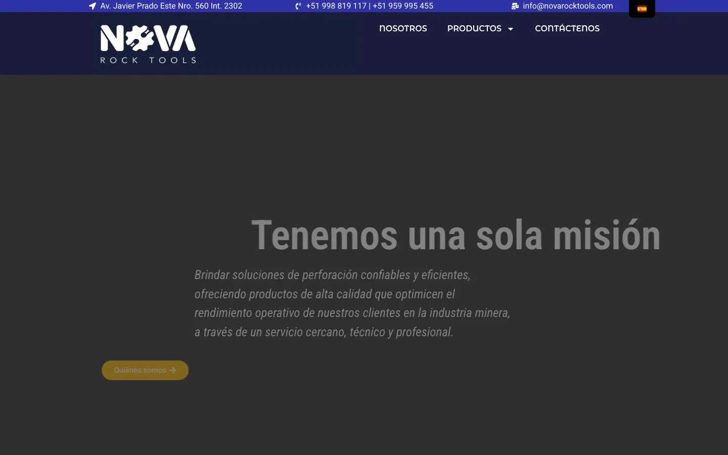
The brief was four words: "We need a website."
No designer. No brand guide. No mockups. A logo, a handful of product photos, and a client — a Lima-based mining equipment company called Nova Rock Tools — who knew exactly what they needed their customers to feel, but couldn't sketch it for you.
This wasn't a redesign from a Figma file. It was a business translation exercise: turn a vague need into a site that felt credible to mining procurement teams. That's the most common brief a solo developer gets, and it's the one nobody really talks about.
The client: B2B, industrial, bilingual
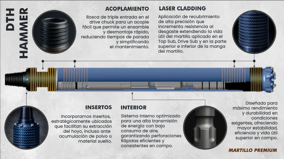
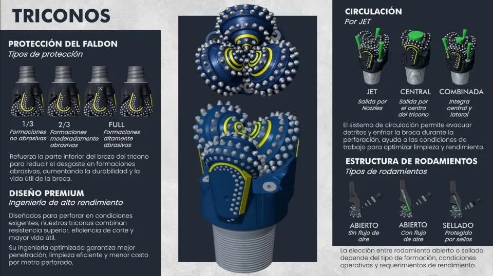
Nova Rock Tools makes DTH hammers, drill bits and tricones for mining, water-well drilling, construction and geological exploration. Their customers are procurement engineers at Peruvian mining companies — people who need to trust a supplier before they'll put their number on a quote request. There's no impulse buy. There's no "add to cart." There is: does this company look like they know what they're doing?
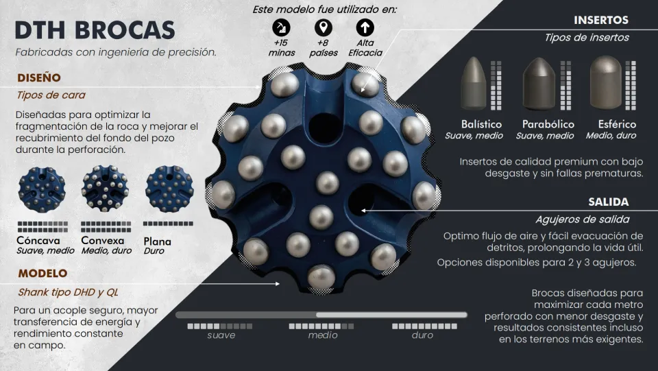
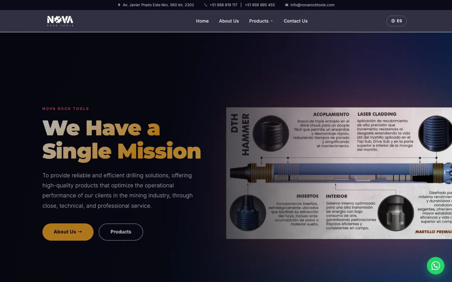
The site also had to speak two languages. Spanish is the language of the business, but ISO certifications and export enquiries increasingly come from English-speaking engineers. One codebase, two audiences — and no brief for either.
What "no designer" actually means
When there's no designer, you don't get a blank canvas — you get a harder constraint. You have to derive the design from the content, not the other way around.
That means asking different questions at the start:
- What does this customer already trust? (Heavy industry, precision — think Bosch, Atlas Copco. Not playful. Not loud.)
- What's the single thing a visitor should believe after 10 seconds? (These people know their product.)
- Where does the customer go when they're convinced? (WhatsApp — not a contact form. WhatsApp.)
The Design Rule
Every decision ran through the same three filters.
Those three filters produced most of the design decisions: dark, high-contrast type; clean product photography with no noise around it; a floating WhatsApp CTA pre-filled with the product name, because that's how deals actually happen in Lima in 2025. The goal was not to make it exciting. The goal was to make it credible.
Why static — and why it mattered
The original site was a hand-rolled Svelte SPA — a blank <div id="app"> until ~110 KB of JavaScript had downloaded, parsed, and run. For a business that lives on
WhatsApp link previews and Google, that's not a performance problem. It's a trust problem.
WhatsApp scrapers don't execute JavaScript. Share a product page link and your customers see the homepage thumbnail, every time, for every product. The fix was migrating to SvelteKit with static prerendering — all nine routes built to real HTML at deploy time, served from Cloudflare's edge. Correct Open Graph tags on every page. A real 404. No JavaScript required for first paint.
Before → After: WhatsApp link preview
SPA — every page looks like this
novarocktools.com
Nova Rock Tools
Herramientas de perforación DTH para minería…
Static — correct per page
novarocktools.com
Martillo DTH NRT45DH — Nova Rock Tools
Martillo de alta eficiencia para perforación…
The SPA returned a blank image + generic title for every URL — because scrapers never executed the JS that set per-page og:* tags.
After prerendering, each product page ships its own correct title, description, and product photo in the initial HTML.
The Image Problem
4.2 MB per page load — mostly images no one audited.
| Asset | Before | After (WebP) | Reduction |
|---|---|---|---|
| Hero hammer | 1.78 MB | 77 KB | 96% |
| Drill bits | 1.39 MB | 214 KB | 85% |
| Tricones | 1.33 MB | 230 KB | 83% |
| Hammer (small) | 749 KB | 92 KB | 88% |
Converted with cwebp -q 82 at three widths (480/960/1440 px).
The hero was hidden on mobile with display:none in the original —
which doesn't stop the download. Phones were paying 1.78 MB for a picture they never saw.
The Fix
A <Picture> component emits a proper <picture> element
with srcset + sizes,
explicit dimensions to kill CLS, fetchpriority="high" on the LCP image,
and a mobileSkip prop for
decorative heroes that phones never show. Phones skip the download outright rather than
fetching an image and hiding it — the note under the snippet explains how.
<!-- Hero — fetchpriority high; mobileSkip keeps it off phones (see note) -->
<Picture
  src="/img/dth-hammer.png"
  alt="DTH hammer NRT45DH"
  widths={[480, 960, 1440]}
  sizes="(min-width: 1024px) 50vw, 100vw"
  mobileSkip
  fetchpriority="high"
/>

<!-- Below-fold product — lazy, no mobile skip -->
<Picture
  src="/img/triconos.png"
  alt="Tricone drill bits"
  widths={[480, 960]}
  sizes="(min-width: 768px) 400px, 100vw"
  loading="lazy"
/>mobileSkip, the only <source> is media="(min-width: 640px)", and the <img> fallback is a 1×1 transparent GIF data URI.
Below 640px no source matches, so the browser uses the fallback and never requests the hero. Hiding it with display:none doesn't help either; hidden images are still fetched.Making design decisions without a design education
This is where most developer-as-designer writing gets dishonest. The honest version: you lean on constraints.
When you're building for a Peruvian mining-tools company:
- The palette is dark, slate, industrial — because the product is.
- The typography is clean and readable at small sizes — because engineers read specs, not copy.
- The layout puts the product image and CTA first — because the goal is a WhatsApp message, not time-on-site.
- The bilingual toggle is visible and persistent — because switching languages mid-visit is a real behaviour.
None of those are especially creative decisions. They're correct ones. Consumer brands need to delight; industrial B2B needs to not scare people off.
The part AI actually helped with
The audit that surfaced the image problem, the font-loading issue, the injection-prone contact form, the buttons masquerading as links — that was done by pairing with an AI agent that read the entire codebase and ran real measurements. Not "you should probably optimise images" but "dth-hammer.png is 1.78 MB; at 960w WebP it's 77 KB; here's the cwebp command."
What AI can't do: tell you what the site should feel like. It can't know that a floating WhatsApp button is the most important UI element on the page. It doesn't know that ISO certification badges are a trust signal, not decoration. It can't decide the design should signal "precision" rather than "friendly."
Those are design decisions, and they come from understanding the client's world. That's still the part that requires a human in the room.
What changed
Before and after, in plain numbers.
The live site at novarocktools.com is a fully static SvelteKit build on Cloudflare Pages — nine prerendered routes, WebP images, self-hosted fonts, a SvelteKit contact endpoint on Cloudflare that sends through Resend, with validation, escaping and a honeypot, and a floating WhatsApp CTA on every product page.
The final site is not trying to be flashy. It is static, fast, bilingual, crawlable, shareable on WhatsApp, and clear about what Nova Rock Tools sells. For this kind of business, that is the design win: not delight, but confidence.
That was the brief.
What I'd improve next
- Add product structured data (JSON-LD) for each tool — drilling equipment queries are specific and long-tail.
- Downloadable PDF spec sheets per product, gated behind the WhatsApp CTA.
- Track WhatsApp CTA clicks by product to understand which tools drive the most enquiries.
- Spanish-first SEO landing pages targeting specific drill types and mining regions.
- A small FAQ section answering "¿Hacen envíos a mina?" and "¿Tiempos de entrega?" — these are the questions buyers actually ask before enquiring.
Next up
7 min · 2019–23
Four Years, Two Frameworks, One Mission
Case Study · SAUT